Satisfactions with Electoral Systems.
As a senior in the mathematics department at UNI, you get the opportunity to do an independent study with an adviser. Dr. Somodi graciously allowed me to work with him as I wanted to use the techniques we had been learning in my Statistical Computing class with him to do some data analysis of a data set I had found provided by the Comparative Study of Electoral Systems or CSES. I selected Module 4 which focused on satisfactions with democracy in various countries.
I began by downloading the data set which was quite large. I was unable to open it on my notebook, so I spent a lot of time using one of the machines in the math departments computer lap. The data set was 64,219 x 462. The NA's proved to be a little frustrating as they weren't consistently coded across columns with some having 9 as NA and others 999 or 9999. Which made the clean up in excel particularity difficult to code in an R friendly format.
For my prediction of satisfaction with democracy I considered anything rated 3 or above to be satisfied and all others to be dissatisfied. I then selected the following variables for use in prediction: Election Type (Legislative or presidential or hybrid), State of Economy, Perception on Health Spending,Perception on Welfare Spending, Perception on Police Spending, Perception on Defense Spending, Perception on Education Spending, and Perception on Unemployment Spending. Perception on spending was a scale of 1 to 5 with 1 being to little, 5 being to much.
I began by preforming basic clustering to understand better the groups of individuals in the data. I turned to the method of Kohonen Network a self organizing mapping method based on early neural networks. I chose this as I had the tools that made it fairly easy to visualize and and see what made up each cluster. I chose 9 clusters and got to work with the mapping. Cluster 3,2 had the largest number of people and cluster 2,1 had the fewest. I chose 9 based of a test built into the package that suggested that many, though based on the output I think that may have been too many.
I then went a colored the clusters by the differing variables creating cluster maps like this. They're a little ugly, but they allow me to see the composition of each group using jitter to spread them out.
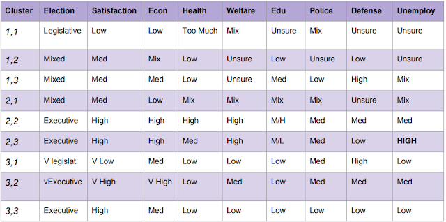
All cluster colorations can be found in the powerpoint. I then used the visulization and summary tools in R to develop cluster profiles which are shown in this table.
After doing this cluster analysis, I wanted to predict voter turnout and I used linear regression, This for a verity of reasons failed to meet the assumptions or to provide a workable model. Looking back on this now, I probably should have tried this as a classification problem, and used logistic regression.
I then attempted to do classification of the strength of democracy using classical decision trees and random forests.
Decision Trees were marginally useful with just under 70% accuracy which for predicting a humans satisfaction with an abstract concept seemed like a success. Random forests were slightly more reliable with 72% average accuracy.
For my full report please see my paper and PowerPoint.
EDIT: there was a link to a PDF of my report hosted on Google Docs. However due to UNI removing my student account after a year of graduation (despite saying it would be there forever at orientation) I no longer have access to that PDF. I'm in the process of trying to find another copy that may have survived but for now, the PowerPoint is all I have.


Comments
Post a Comment